Showing posts with label altered. Show all posts

Monday, 28 June 2021

Quiet Moments - Art Journal Cover for Finnabair

Hello darlings,


I want to share my Quiet Moments with you. It’s a journal I have recently started, to capture those precious, still, quiet, little moments in life that may not at first seem much, but when you actually stop and see, are actually everything.


In other words, my Quiet Moments journal is one that I pour my soul into, using whatever inspires me right there and then. It’s a nature journal of a sort, as I love using dried and pressed plants I have collected from our own garden. So, I thought the cover needs to reflect the concept of the journal and wanted it to look as natural as it can be, something lost and found in the forest.


The journal itself is a Finnabair Art Daily Square Journal, 5.5 inches, 14cm in size. I had no clear vision in mind when I started decorating the cover, as I wanted it to be just like the inside; made with love and care, listening what my heart wants to say. So, I just picked some inspiring elements and started. You can see the entire process in my video, from start to finish, how I started layering and picking colours and so on, intuitively and slowly building the look I was after. One thing I knew from the start was that I wanted the cover reflecting life with its full beauty: the light, the rough darkness in one harmonious balance.


So, I started with attaching some jute cord ribbon with Soft Matte Gel into the background to give it roughness to start with, and then primed the cover with Heavy Gesso.


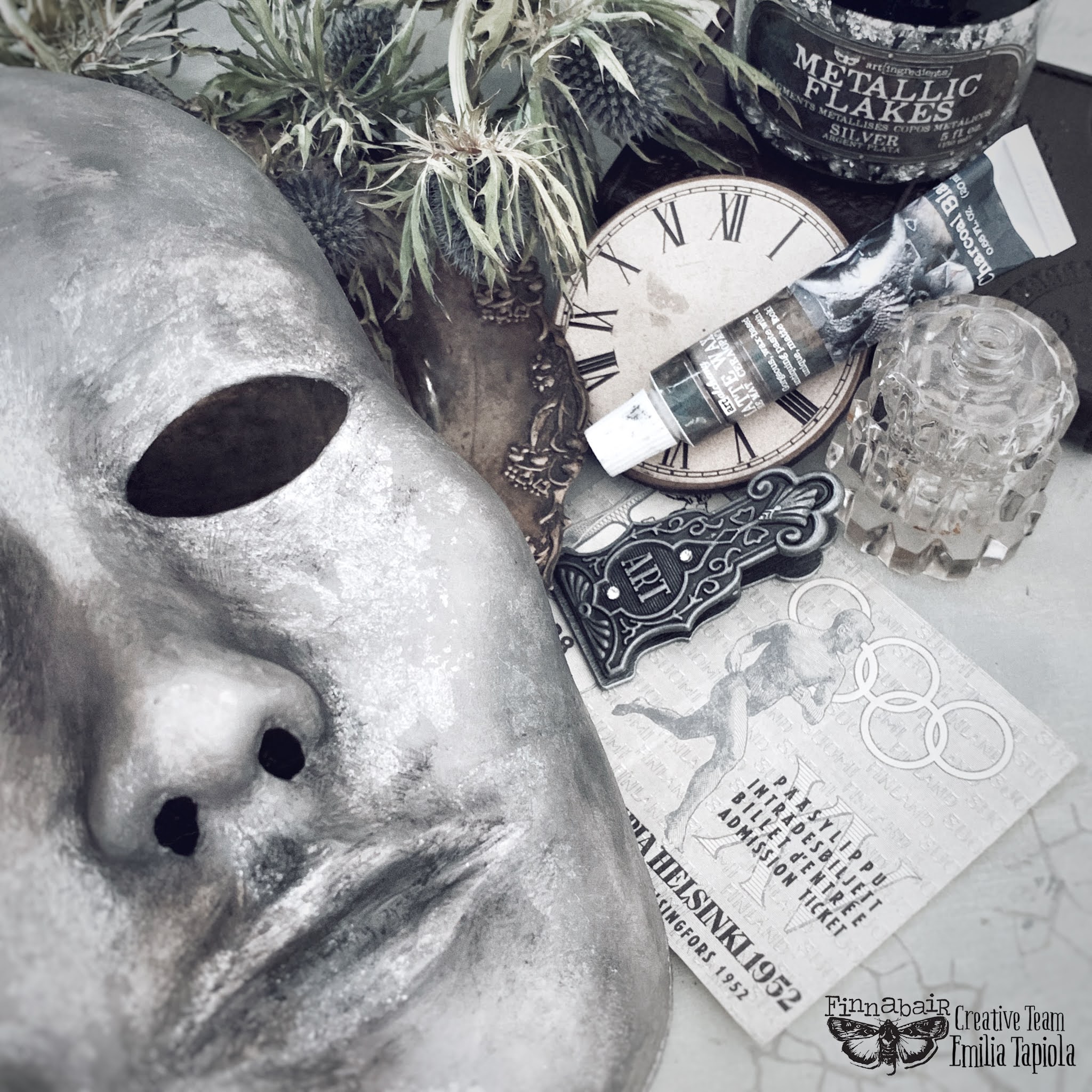
Then, I started to arrange the composition. I wanted to include some familiar elements I love and am always using, like ripped old cardboard pieces, lace I have dyed myself, using plants and flowers from our own garden, but I also wanted to use the inspiring, new Finnabair Winter 2021 Release products.


I layered some lace and cardboard to make the background and added a broken clay frame piece from the new Grungy Frames mould that I had managed to drop to the floor and break. I thought it’d make a beautiful detail and underlines the thought of my journal; everything has beauty in it. For me, broken pieces are usually the most beautiful and meaningful, so I wanted the broken frame to have a prime spot.


I attached everything with Heavy Body Gel and as I wanted some roughness in there to resemble moss, I added some White Sand Texture Paste and Mini Art Stones to the cover, too. Then, I primed everything with Heavy Gesso.


I wanted the cover to look mossy and tattered, like it has been left into the forest for ages, so I tried to imitate that with my paints. I mixed Impastos Snow White, Pitch Black, Burlap, Linen, and Dark Chocolate and used brush and baby wipes to blend the paints to the cover.


Next, I added some shadowing in form of Liquid Acrylics Burnt Sienna, Ink Black, Umber, Ochre, and Avocado Green.


I also thought that where there is darkness, there is also light, so I used the new Gold Metallic Flakes to give some warm glow to the composition. Using Gilding Glue, I attached just a hint of gold flakes here and there. Then I gently added some new Sage Leaves Matte Wax on top of the gilding, as it is just the perfect shade to make the gilding gold look more aged and worn.


And my Quiet Moments cover was finished. You can follow the whole creative process from start to finish in my long video, where I explain in detail what I am doing and how and why and guide you through the whole intuitive crafting process, sharing my thoughts about quiet moments and life along the way.


Link to the video: https://youtu.be/YMedX5foXfE


Wishing you glimmering light and peaceful, quiet moments, 

Emilia


NEW FINNABAIR WINTER RELEASE MATERIALS USED:

DESERT FLOWER MECHANICAL SET

SCRAPYARD DRAGONFLIES MECHANICAL SET

RUSTY PAPER CLIP

DECORATIVE CHIPBOARD MECHANICAL FLOURISHES

GRUNGY GEARS

FINNABAIR GRUNGY FRAMES MOULD

MATTE WAX SAGE LEAVES

GILDING GLUE

METALLIC FLAKES GOLD


OTHER MATERIALS USED:

https://mixedmediaplace.com/prima-art-daily-chipboard-journal-5-5-x-5-5

https://mixedmediaplace.com/prima-art-basics-soft-matte-gel

https://mixedmediaplace.com/prima-art-basics-heavy-gesso-white

https://mixedmediaplace.com/prima-art-basics-heavy-body-gel

https://mixedmediaplace.com/prima-art-extravagance-texture-paste-white-sand-tube

https://mixedmediaplace.com/prima-art-ingredients-art-stones-mini

https://mixedmediaplace.com/prima-art-alchemy-liquid-acrylic-ink-black

https://mixedmediaplace.com/prima-art-alchemy-liquid-acrylic-burnt-sienna

https://mixedmediaplace.com/prima-art-alchemy-liquid-acrylic-titanium-white

https://mixedmediaplace.com/prima-art-alchemy-liquid-acrylic-umber

https://mixedmediaplace.com/prima-art-alchemy-liquid-acrylic-avocado-green

https://mixedmediaplace.com/prima-art-alchemy-liquid-acrylic-ochre

https://mixedmediaplace.com/prima-art-alchemy-impasto-paint-dark-chocolate

https://mixedmediaplace.com/prima-art-alchemy-impasto-paint-linen

https://mixedmediaplace.com/prima-art-alchemy-impasto-paint-burlap

https://mixedmediaplace.com/prima-art-alchemy-impasto-paint-pitch-black

https://mixedmediaplace.com/prima-art-alchemy-impasto-paint-snow-white

https://mixedmediaplace.com/prima-finnabair-mechanicals-rusty-labels

https://mixedmediaplace.com/prima-finnabair-mechanicals-woodland-ferns


Thursday, 3 June 2021

Mystic Pencil Silver Mask - Finnabair Creative Team Art


I knew I was in trouble, when my teenager asked me to alter a plastic mask for his Dj purposes. I knew I could say no, as he’s the one who has composed the most beautifully soft music for my videos; now it was payback time. But how could I do it, create something masculine, when everything I do has a habit of turning into some kind of shabby chic softness?


Well, I had no choice, had I? So, I gessoed the plastic mask, painted it over with Snow White Impasto paint (and chuckled while doing so, as Snow White and masculine aren’t the usual terms connected), and started to wonder what I should do next. I can assure you; it was a trial-and-error process for me… 


I noticed that the layers started to slowly slip from the plastic surface, so I added another layer and sealed it with Soft Matte Gel. It helped for a while, but I wasn’t happy with the uneven surface and added a layer of Old White matte wax to cover it all. Then I painted strong shadows using Impastos Pitch Black, Dark Chocolate, and Snow White, to get more dimension and some structure into the mask and added another white Impasto layer on top with a very soft sponge.


Again, I didn’t like the outcome, way too creepily skull style for my liking, so I decided to add some waxes on top. I mixed Charcoal Black, Graphite, and Brushed Iron with some Rusty Brown to give it warmth and applied the wax to the mask. It was looking really good, but the layers started to move again under my brush and revealed white areas. What can a girl do but do some serious patching? So, I took my Silver Metallic Flakes and Gilding Glue and started my mixed media patching work, adding silver flakes everywhere there was white spots. And I could see in the instant the first flake softly landed onto the mask that now we had a winner and as perfect a match as perfect match can go.


I waited until I was absolutely certain that the waxes and the gilding glue were completely dry, and took a blending brush and brushed the flakes as hard as I could (keeping in mind the “moving”, thin plastic surface) until all the silver flakes kind of blended into the background. Then I took Charcoal Black, Old Silver, and Graphite waxes and very, very gently spread some onto the flakes, to make sure they really looked old and worn like an old statue and added black mica powder to highlight and shadow the nose and lip lines. Just to be on the safe side, I added a layer of Soft Matte Gel on top, to protect all the layers.


And… I did it! I managed to create something if not grungy masculine, then at least not-creepy-masculine-ish and it turned out to be one of my favourite projects of all because of its challenging difference!


P.S. Yes, my son loved his mask!


Materials Used:


https://mixedmediaplace.com/prima-art-ingredients-metallic-flakes-silver


https://mixedmediaplace.com/prima-art-extravagance-gilding-glue


https://mixedmediaplace.com/prima-art-basics-heavy-gesso-white


https://mixedmediaplace.com/prima-art-basics-soft-matte-gel


https://mixedmediaplace.com/prima-art-alchemy-impasto-paint-dark-chocolate


https://mixedmediaplace.com/prima-art-alchemy-impasto-paint-pitch-black


https://mixedmediaplace.com/prima-art-alchemy-impasto-paint-snow-white


https://mixedmediaplace.com/prima-art-alchemy-metallique-wax-vintage-gold


https://mixedmediaplace.com/prima-art-alchemy-metallique-wax-old-silver


https://mixedmediaplace.com/prima-art-alchemy-matte-wax-charcoal-black


https://mixedmediaplace.com/prima-art-alchemy-metallique-wax-graphite


https://mixedmediaplace.com/prima-art-alchemy-matte-wax-rusty-brown


https://mixedmediaplace.com/prima-art-alchemy-metallique-wax-brushed-iron


https://mixedmediaplace.com/prima-art-alchemy-matte-wax-old-white


Friday, 19 March 2021

Open Me Carefully - Art Journaling for Finnabair


Hello darlings,


My Quiet Moments journal has got a new page that I want to share with you!


My Quiet Moments journal is my very special journal where let my heart tell what it has to say. I pick some inspiring elements like a dried flower from our garden, a bit of lace, or a quote that feels perfect there and then, and try to capture those little moments in life that makes it so precious. Which means, I want the journal to reflect the fragile beauty and light of life, without forgetting there wouldn’t be light without darkness. 


The journal is a Finnabair Art Daily Square Journal, 5.5 inches, 14cm in size, so it is perfect size for this kind of purpose, where the main element is a dried flower, or a quote typed with a vintage typewriter.


My way of journaling is very intuitive, so I had no clear vision what I was going to do, except for using some vintage dyed lace and soft, creamy colours. You can follow the entire creative journey in my long, tranquil video, where I tell you how, why, what, and a lot more along the way.


I roughly planned the general elements for the page and their composition, glued a 7 Dots Studio paper on the background, and started to layer vintage paper bits and used tea bags on the pages, attaching them with Soft Matte Gel. Next, I primed the pages very lightly with Heavy Gesso, and after the pages were dry, I sewed and glued laces where I wanted them to go.


I ended up choosing Pearly Everlasting (Anaphalis margaritacea) as the dried flower for my journal spread. It’s one of my favourite flowers with its soft, gentle look and we have had it in our garden for years, but I fell head over heels in love with it last summer, when I learnt that it is actually a very powerful medicinal plant and most of all, that it symbolizes hope and strength. It instantly got a firm top 3 position in my favourite plants list! 


Of course, I wanted a matching quote, something reflecting the fragile, yet hopeful message of the journal spread, and ended up using one of Emily Dickinson’s poems. I had written the quote with my vintage typewriter on Japanese rice paper, which suits the task perfectly and kind of blends into the page. I attached both the Pearly Everlasting and the quote to the page using Soft Matte Gel.


Next, I needed to decide the colour theme, which wasn’t that hard, as Pearly Everlasting and the laces kind of demanded soft beiges and cream. I mixed a light paint mix using Impastos Snow White and Linen with just a merest hint of Pitch Black and Dark Chocolate for depth and added only a very light coat of paint onto the page, blending and wiping most off with a baby wipe.


Next, I added a bit shadowing into the page edges and around the dried flower with Liquid Acrylics Burnt Sienna, Umber, and Ink Black.


For highlighting, I used the new Winter Release Gold Metallic Flakes and using Gilding Glue I attached just a tiny amount of gold flake traces here and there, applying some new Sage Leaves Matte Wax on top of the gilding, to make it look more aged and worn.


And the journal spread was finished. It truly whispers the message of hope and strength with the soft colouring, with the light, gentle gilding, and with the soft Pearly Everlasting.


Link to the video: https://youtu.be/dkkvbEduoRs


Wishing you gentle moments, 

Emilia


NEW FINNABAIR WINTER RELEASE MATERIALS USED:

MATTE WAX SAGE LEAVES

GILDING GLUE

METALLIC FLAKES GOLD


OTHER MATERIALS USED:

https://mixedmediaplace.com/prima-art-daily-chipboard-journal-5-5-x-5-5

https://mixedmediaplace.com/prima-art-basics-soft-matte-gel

https://mixedmediaplace.com/prima-art-basics-heavy-gesso-white

https://mixedmediaplace.com/prima-art-alchemy-liquid-acrylic-ink-black

https://mixedmediaplace.com/prima-art-alchemy-liquid-acrylic-burnt-sienna

https://mixedmediaplace.com/prima-art-alchemy-liquid-acrylic-umber

https://mixedmediaplace.com/prima-art-alchemy-impasto-paint-dark-chocolate

https://mixedmediaplace.com/prima-art-alchemy-impasto-paint-linen

https://mixedmediaplace.com/prima-art-alchemy-impasto-paint-pitch-black

https://mixedmediaplace.com/prima-art-alchemy-impasto-paint-snow-white


7 DOTS STUDIO PAPER:

Air Mail: Hand Written


Thursday, 18 February 2021

Queen of Tides - Finnabair Creative Team Art


I decorated the cover of my precious and much-consulted Finnabair swatch book with the new release chipboards, moulds, and mechanicals. I had waited for a perfect moment, materials, and inspiration to decorate the cover, but with these new release embellishments, it kind of created itself for me. 


The journal is Finnabair Art Daily Mixed Media Journal, A5 sized, just a perfect size for a swatch journal. My original idea was to paint the cover purple, my favourite colour but somehow, I was drawn to blues and browns.


I started the process with taking some left-over scraps of Finnabair tissue paper and attached the pieces with Soft Matte Gel to the cover, crumbling and folding while doing it, so it made a bit uneven base, and then primed it with two coats of white Heavy Gesso

Then I decided which embellishments I’d use and how, arranged them on the cover, and attached with heavy Body Gel.

Next, I wanted some more dimensional effect, and mixed Texture Paste White Sand with Mini Art Stones and using a palette knife, smeared some here and there. I did the same with Old Walls Rust Effect Paste, to create more layering. Then, I primed everything with a thin layer of Heavy Gesso. 

For the painting process, I wanted to use my favourite medium, Liquid Acrylics. And as said, my original plan was to use purple shades, but somehow found myself using blues and browns! I started with Prussian Blue, mixing some with Ink Black to create more contrast and depth, and then started to add Umber and Burnt Sienna. I used very diluted paints, and sprayed water to make it spread watercolour-ish way, to create natural blending and lines. Then, I did the same with Titanium White, to blend blues and browns together.

For the painting process, I wanted to use my favourite medium, Liquid Acrylics. And as said, my original plan was to use purple shades, but somehow found myself using blues and browns! I started with Prussian Blue, mixing some with Ink Black to create more contrast and depth, and then started to add Umber and Burnt Sienna. I used very diluted paints, and sprayed water to make it spread watercolour-ish way, to create natural blending and lines. Then, I did the same with Titanium White, to blend blues and browns together.

As the composition started to look more and more like tidal beach colours, I accentuated it and added some Golden Dragon Effect Paste, as the either last or first sunrays reflecting in the sand. I also added some new release Gold Metallic Flakes using Gilding Glue, only a lightest touch of gold in only a couple of places to highlight the composition. After gilding, I added new release Sage Leaves Matte Wax to give the gilding antique look.

As the final touch to highlight the Queen of Tides (the mould) and some art pebbles, I added a light coat of White Pearl Metallic Wax, and my Finnabair swatch book cover was finished! 

See (the very unlike-me speeded-up) tutorial video here: https://youtu.be/c0LYbl0vIUA
 
Wishing you beautiful moments in your favourite colours,
Emilia


NEW FINNABAIR WINTER RELEASE MATERIALS USED:

DESERT FLOWER MECHANICAL SET

SCRAPYARD DRAGONFLIES MECHANICAL SET

DECORATIVE CHIPBOARD MACHINE FLORAL DECORS

MECHANICALS GRUNGY GEARS

MOULD VINTAGE PORTRAIT

MATTE WAXC SAGE LEAVES

METALLIC FLAKES GOLD

GILDING GLUE

MATTE WAX SAGE LEAVES


OTHER MATERIALS USED:


https://mixedmediaplace.com/prima-art-basics-heavy-gesso-white


https://mixedmediaplace.com/prima-art-basics-heavy-body-gel


https://mixedmediaplace.com/prima-art-alchemy-liquid-acrylic-ink-black


https://mixedmediaplace.com/prima-art-alchemy-liquid-acrylic-prussian-blue


https://mixedmediaplace.com/prima-art-alchemy-liquid-acrylic-burnt-sienna


https://mixedmediaplace.com/prima-art-alchemy-liquid-acrylic-titanium-white


https://mixedmediaplace.com/prima-art-alchemy-liquid-acrylic-umber


https://mixedmediaplace.com/prima-art-alchemy-metallique-wax-white-pearl


https://mixedmediaplace.com/prima-art-extravagance-texture-paste-white-sand-tube


https://mixedmediaplace.com/prima-art-extravagance-texture-fantasy-old-walls


https://mixedmediaplace.com/prima-art-ingredients-art-stones-mini


https://mixedmediaplace.com/prima-finnabair-tissue-paper-wilderness


https://mixedmediaplace.com/prima-finnabair-mechanicals-antique-labels


https://mixedmediaplace.com/prima-finnabair-mechanicals-woodland-ferns


https://mixedmediaplace.com/prima-art-ingredients-melange-art-pebbles


https://mixedmediaplace.com/prima-art-daily-chipboard-journal-5-5-x-8